Canungra

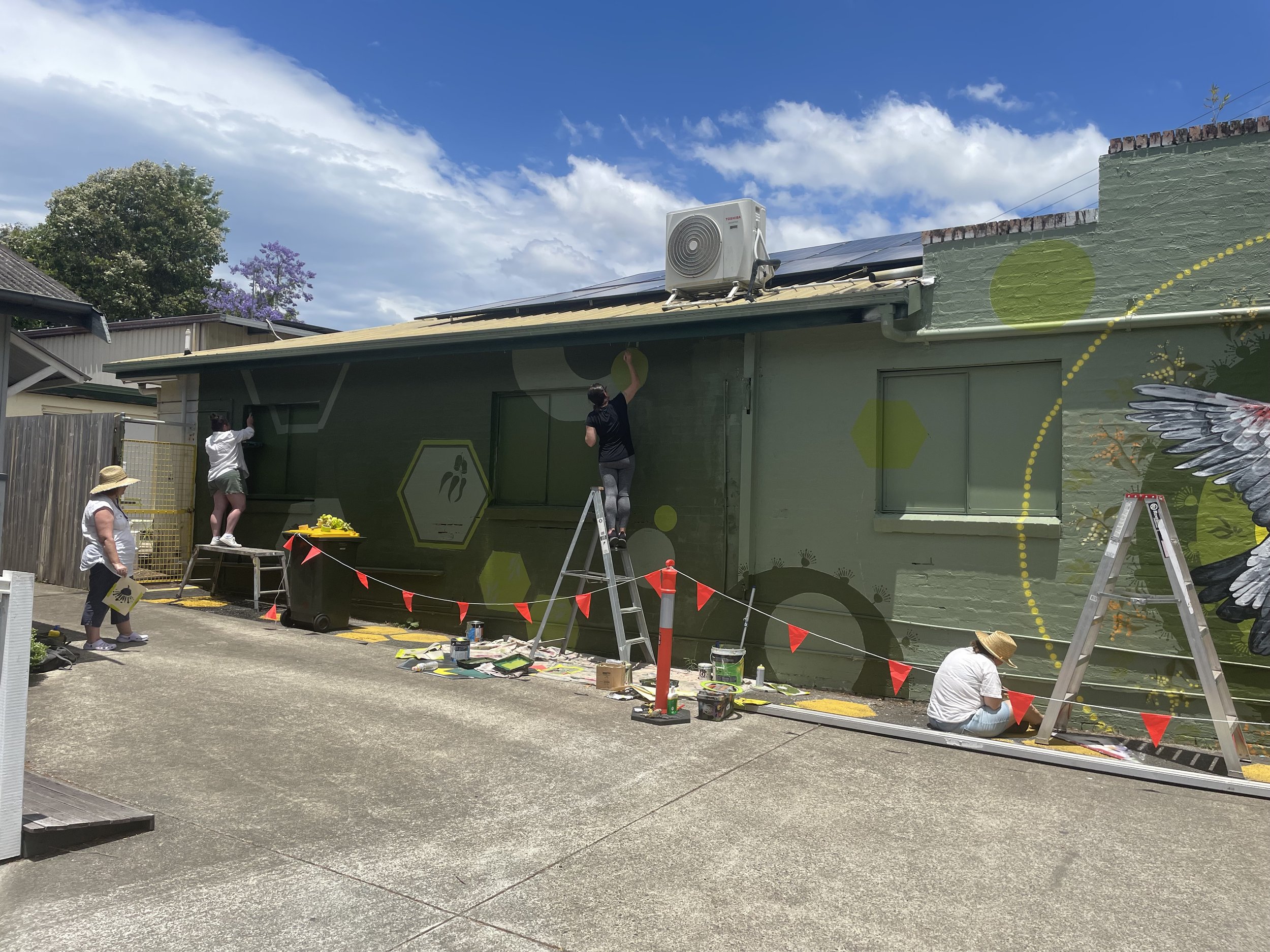
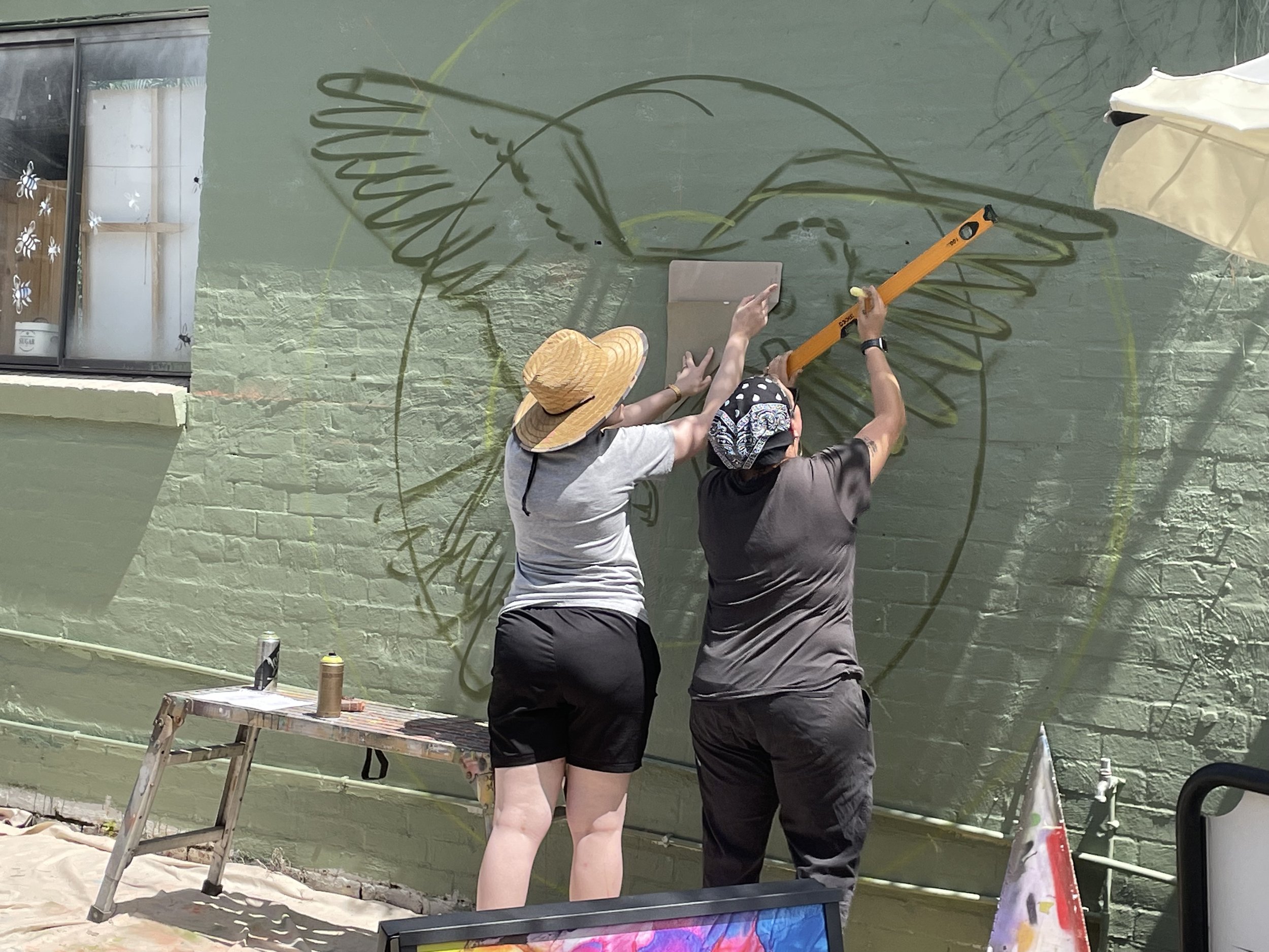
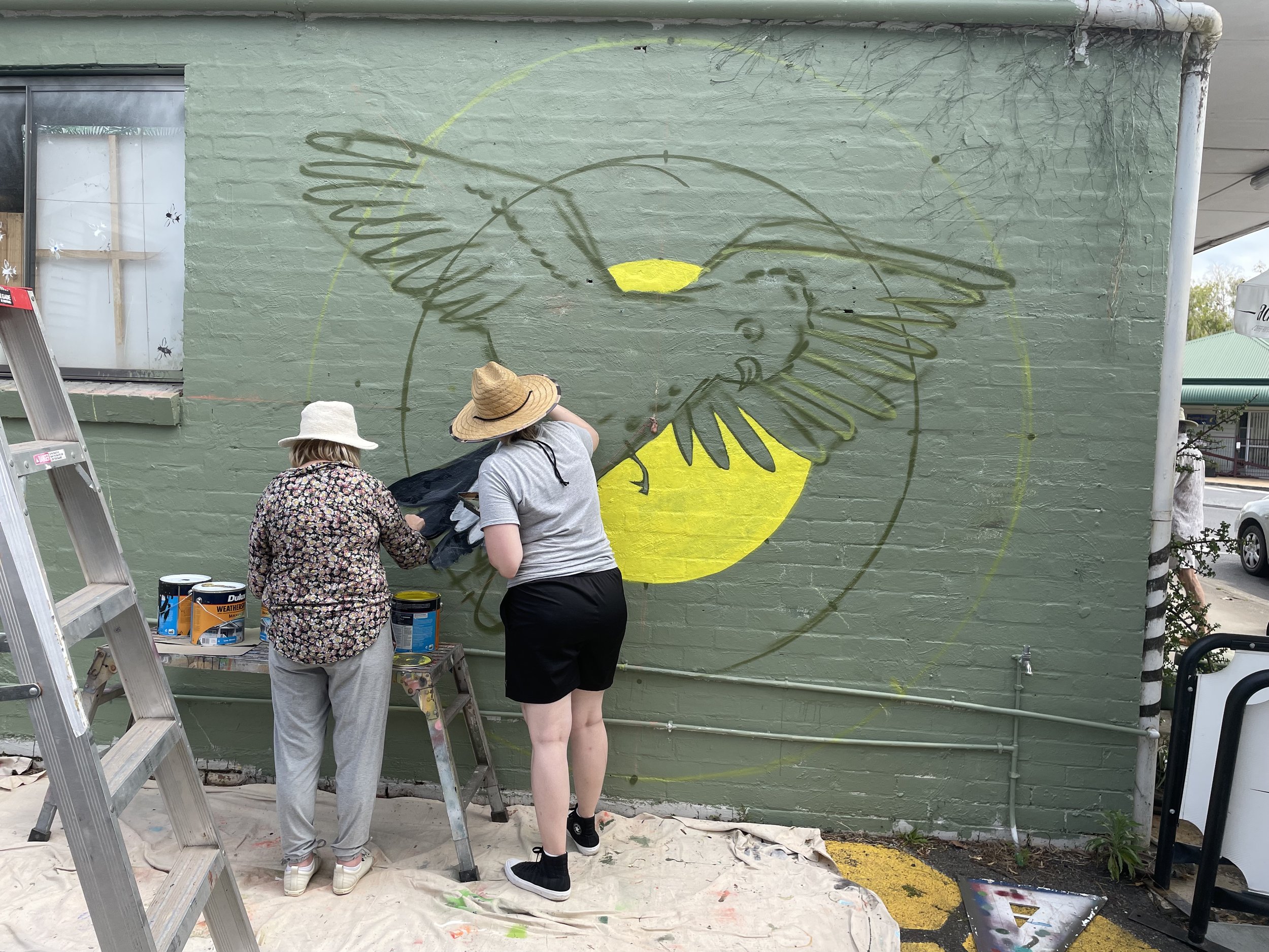
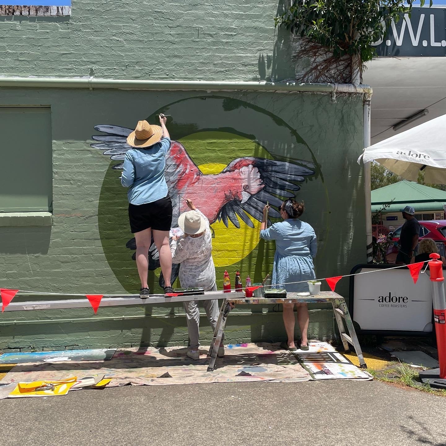
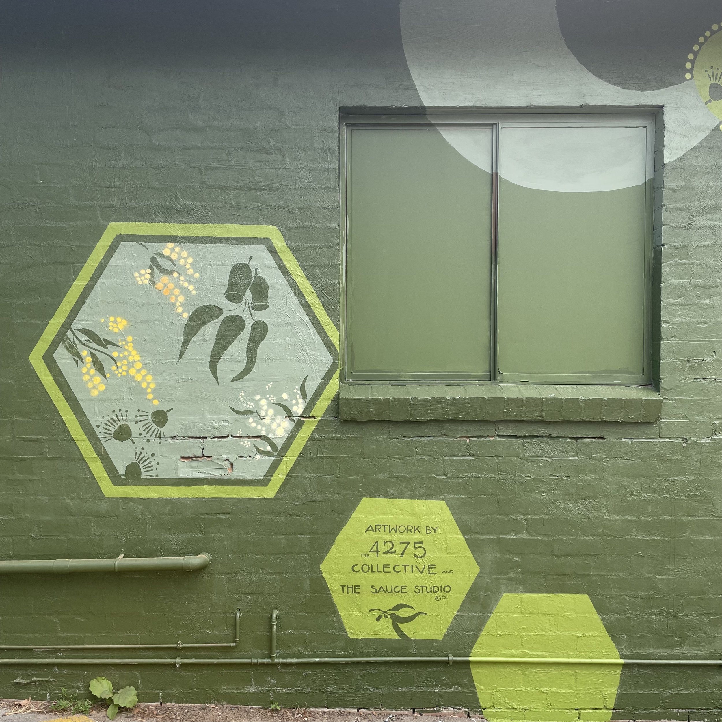
Today wrapped up a project with the fabulous 4275 collective in Canungra. A solid core group of artists and makers painted a mural for the wallflower project in the CBD. The galah feature, floral stencils and geometric elements were painted almost entirely by participants. The design undertook several incarnations and we allowed for elements to evolve throughout the painting process. An impressive effort for first time mural artists and such a fantastic response from the public made this an enjoyable project to facilitate. Check out the Maker Space, Owl Wholefoods and Canungra Books and Art for a dose of good things!

Parks and Recreation

Over the weekend, Sauce and I caught an old Parks and Recreation episode, The Camel where the Parks Department design a new mural for the town. Not only did we laugh ourselves silly because Parks and Recreation is one of the best Sit-Coms around (Ron Swanson is pretty damn funny), but the episode remind us of some experiences we’ve both had when dealing with past clients and councils. In light of the mistakes made by Leslie Knope and the rest of her team in the Parks Department, I thought I would add a post with some hints and tips about designing and commissioning a mural.


  •  Have a clear idea about why you’re commissioning a mural, and allow this to set the tone and theme. If you want a mural to encompass a town, think of the narrative or story that town has to offer. Also, keep in mind of the whole story of the town. In the Parks and Recreation episode, a new mural was commissioned, since the original mural was defaced due to it’s racist undertones. 


  • Who is the target audience? Is this mural a part of a graffiti management strategy, or is it about adding colour? Is the mural a part of your advertising strategy, or all of the above? A mural can be an effective way to discourage unwanted vandalism, but this is only going to work if it is culturally appropriate. The target audience should influence and shape the theme. A lovely and peaceful scene of an elderly person feeding the pigeons in the park sounds great on paper, but if you want to deter vandalism, you’re going to need to add something a bit more relevant.

  •  Where is the mural? If the mural is in the CBD of town, or an area of high traffic, then it is worth spending more time and effort to make it stand out and memorable. If the mural is in a town, will people be taking photos and selfies in front of it? Is this mural a large component of your advertising strategy? The saying of ‘you get what you pay for’ rings true here. If you want a showpiece or stand out feature, it pays to hire a professional mural artist who can guide you through the design process. By asking people with no public art experience and expecting a committee to make an assertive and creative design you’re just setting yourself up for failure. And let’s not forget one of the most realistic lines from the show:

Landscape Architect: “It’s a camel.”

Leslie Knope: “A camel?”

Landscape Architect: “A camel is what you get when you ask a committee to design a horse.”

And lastly, be mindful of simplicity. There is nothing worse than a convoluted message which tries to be all things at once. 


To organise a design consultation, contact us today.


Serviceton South State School

Last week I spent five days at Serviceton South State School, where I painted four walls which were used to express a Celebration of Diversity and Culture. Each section has a different culture in relation to the theme and I had fun learning new ways to say ‘welcome’. This mural is on of many different creations I have had the pleasure of painting for the school. Looking foward to working there again in the future and munching more of the tasty sandwiches from the tuckshop.