Parks and Recreation

Over the weekend, Sauce and I caught an old Parks and Recreation episode, The Camel where the Parks Department design a new mural for the town. Not only did we laugh ourselves silly because Parks and Recreation is one of the best Sit-Coms around (Ron Swanson is pretty damn funny), but the episode remind us of some experiences we’ve both had when dealing with past clients and councils. In light of the mistakes made by Leslie Knope and the rest of her team in the Parks Department, I thought I would add a post with some hints and tips about designing and commissioning a mural.


  •  Have a clear idea about why you’re commissioning a mural, and allow this to set the tone and theme. If you want a mural to encompass a town, think of the narrative or story that town has to offer. Also, keep in mind of the whole story of the town. In the Parks and Recreation episode, a new mural was commissioned, since the original mural was defaced due to it’s racist undertones. 
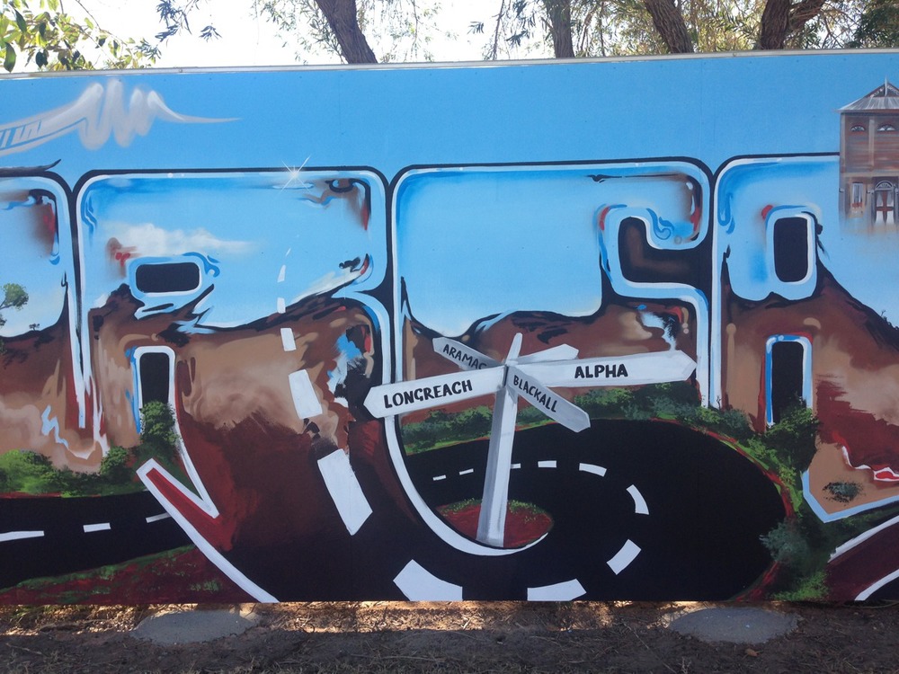
 

  • Who is the target audience? Is this mural a part of a graffiti management strategy, or is it about adding colour? Is the mural a part of your advertising strategy, or all of the above? A mural can be an effective way to discourage unwanted vandalism, but this is only going to work if it is culturally appropriate. The target audience should influence and shape the theme. A lovely and peaceful scene of an elderly person feeding the pigeons in the park sounds great on paper, but if you want to deter vandalism, you’re going to need to add something a bit more relevant.
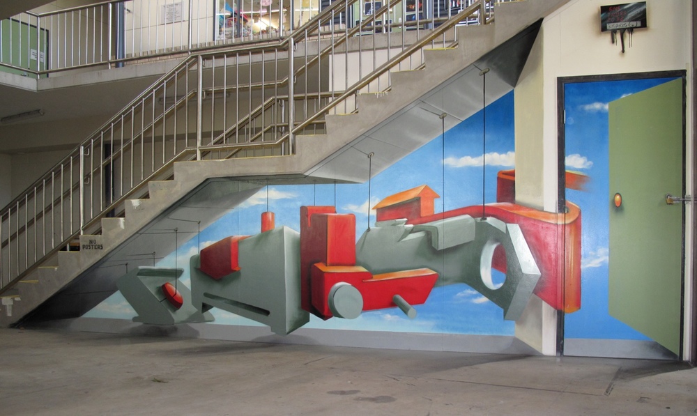
  •  Where is the mural? If the mural is in the CBD of town, or an area of high traffic, then it is worth spending more time and effort to make it stand out and memorable. If the mural is in a town, will people be taking photos and selfies in front of it? Is this mural a large component of your advertising strategy? The saying of ‘you get what you pay for’ rings true here. If you want a showpiece or stand out feature, it pays to hire a professional mural artist who can guide you through the design process. By asking people with no public art experience and expecting a committee to make an assertive and creative design you’re just setting yourself up for failure. And let’s not forget one of the most realistic lines from the show:

Landscape Architect: “It’s a camel.”

Leslie Knope: “A camel?”

Landscape Architect: “A camel is what you get when you ask a committee to design a horse.”
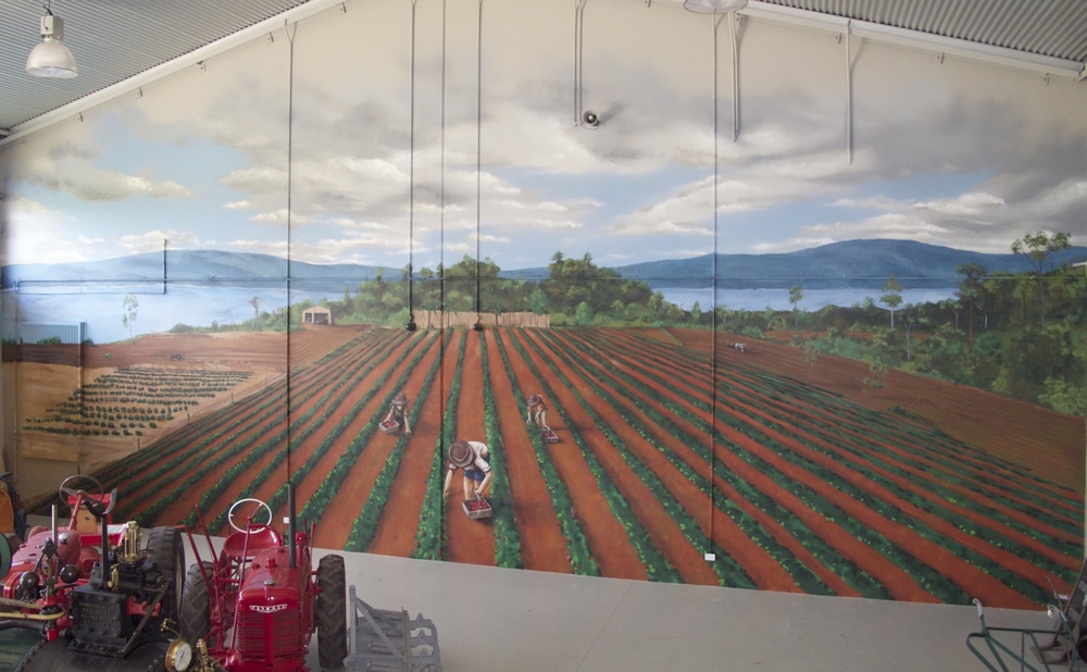
And lastly, be mindful of simplicity. There is nothing worse than a convoluted message which tries to be all things at once. 


To organise a design consultation, contact us today.


Public Art

This week for #ArtThursday, I’m talking about public art. Over the past decade, Sauce has contributed a vast amount of public art to the wider community with numerous murals, some of which were commissioned and funded and others were self directed and self-funded. Either way, the murals all added colour and changed the cultural ambience of the area, which is the main aim of public art. Good public art should add and create a better ambience, it should be aesthetically pleasing to a wide audience, it should invite a positive dialogue and as all good art does it should Comfort the disturbed and disturb the comforted. 

Dick, Head of Department. Sauce, 2014.


This is easer said than done, as there are loads of different pieces of public art in our communities which do not reach a wide audience nor improve the visual and cultural ambience of the area. When I mention public art, how many images of bronze statues of forgotten Kings come to mind, or in our trade, how many faded murals have you seen which were a community project from many moons ago? It’s easy to be scathing of such pieces, however as an industry professionals, Sauce and myself have some insights about the process, and how the bureaucrats manage to make such a mess of it all.


First, there is the procurement process. It is incredibly common to find an Expressions of Interest (EOI) where the details are incorrect, the time schedule is laughable or the project outcomes are not inline with the project details. Usually, this is due to the staff responsible for the project delivery. It is incredibly rare to find a bureaucrat with the experience in arts related project delivery, and even rarer to have people involved in the process who are arts practitioners. For all the fancy words and pretty pictures, most EOIs for public art are cut and pasted from another department and in the case of murals, it’s often about trying to solve an existing problem. Murals are rarely curated or planned into the design of the building or architecture.  


Then there is the million dollar question: How much for the puppy sculpture in the park? Again, the bureaucrats put their two cents in here, and usually the artwork needs to be to a set budget, which isn’t necessarily a bad thing. However this figure is more than likely to be plucked out of thin air, than resemble an amount which will cover the professional delivery of a successful arts project. Again, in our experience, the fees associated with project delivery are unlikely to resemble a price which encompasses the price of materials and the time necessary for the project, it’s more about looking good in glossy brochures and to branch managers. 


So how does the public fare in all of this, and what do they do when they get a dead tree or Poo Sticks in their local park? For the better part, their taxes and rates are wasted on Red Tape. Which isn’t good for anyone, as it means both the artists and the public are missing out on fulfilling cultural experiences. While there are plenty of great artists with even better ideas, there are few opportunities for professional artists to deliver artist driven projects. And don’t even get me started on grants. I’d rather pull my teeth out with pliers than waste my time applying for endless grants. 


So next time you’re reading the paper and notice “some artist” gets “$120,000 for a light installation” or whatever the flavour of the month is, you can guarantee most of the cash went to the bureaucrats, and the artist is most likely still penniless. 

Serviceton South State School

Last week I spent five days at Serviceton South State School, where I painted four walls which were used to express a Celebration of Diversity and Culture. Each section has a different culture in relation to the theme and I had fun learning new ways to say ‘welcome’. This mural is on of many different creations I have had the pleasure of painting for the school. Looking foward to working there again in the future and munching more of the tasty sandwiches from the tuckshop.