Barcaldine

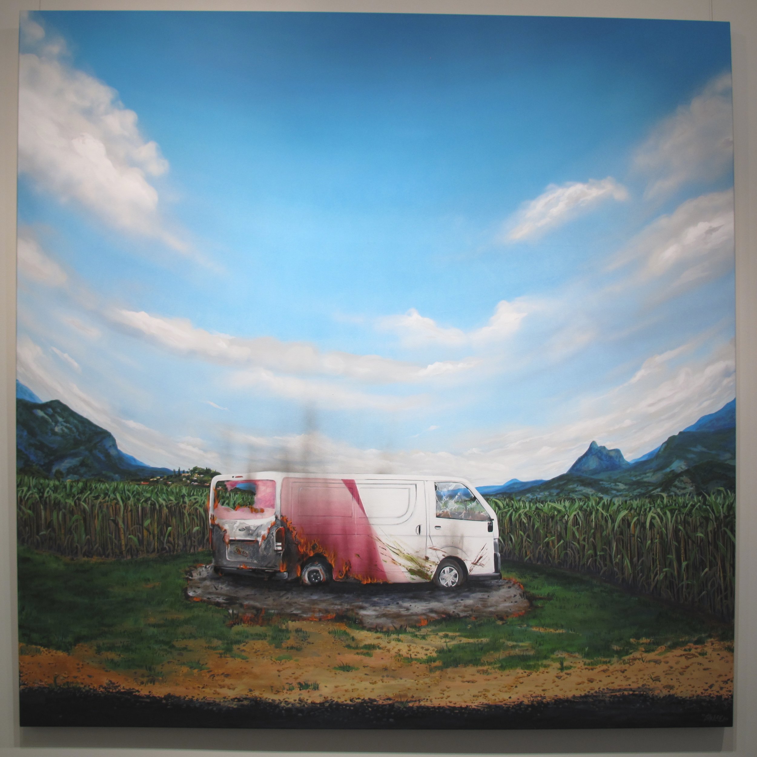
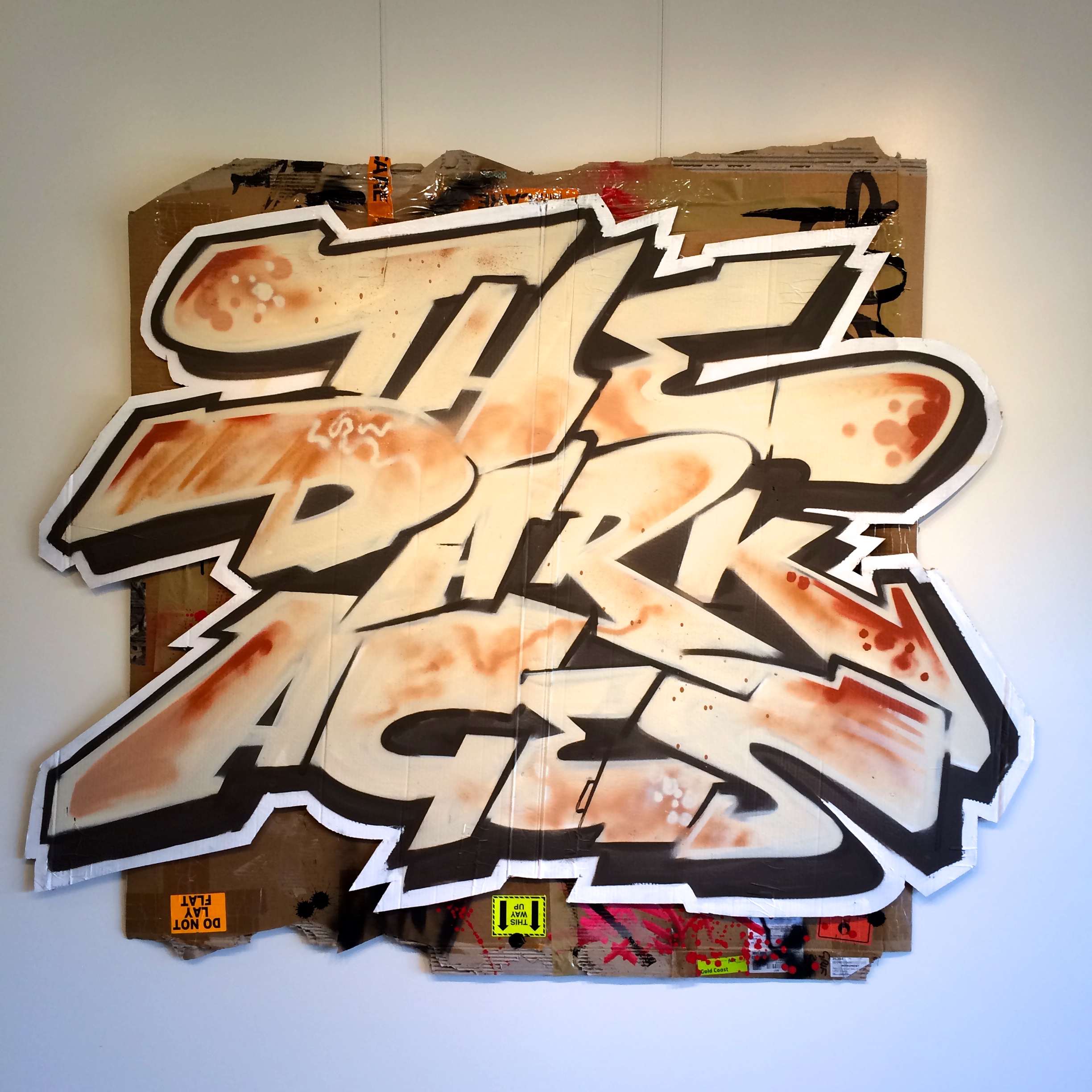
I came up with the working title “Full Circle” a while ago and it’s no suprise that covid and border closures have postponed plans. It began with the concept of my journey as a graffiti artist to exhibiting fine art in a gallery. I soon realised the notion of full circle adapts to many meanings and experiences both within ourselves and external elements amongst nature. I began responding full circle literally, the sphere that sustains us and the beauty provided amongst natural environment. For me this is something that puts life into perspective and is a reminder that we’re only here because of a string of events, circumstances in time and space.

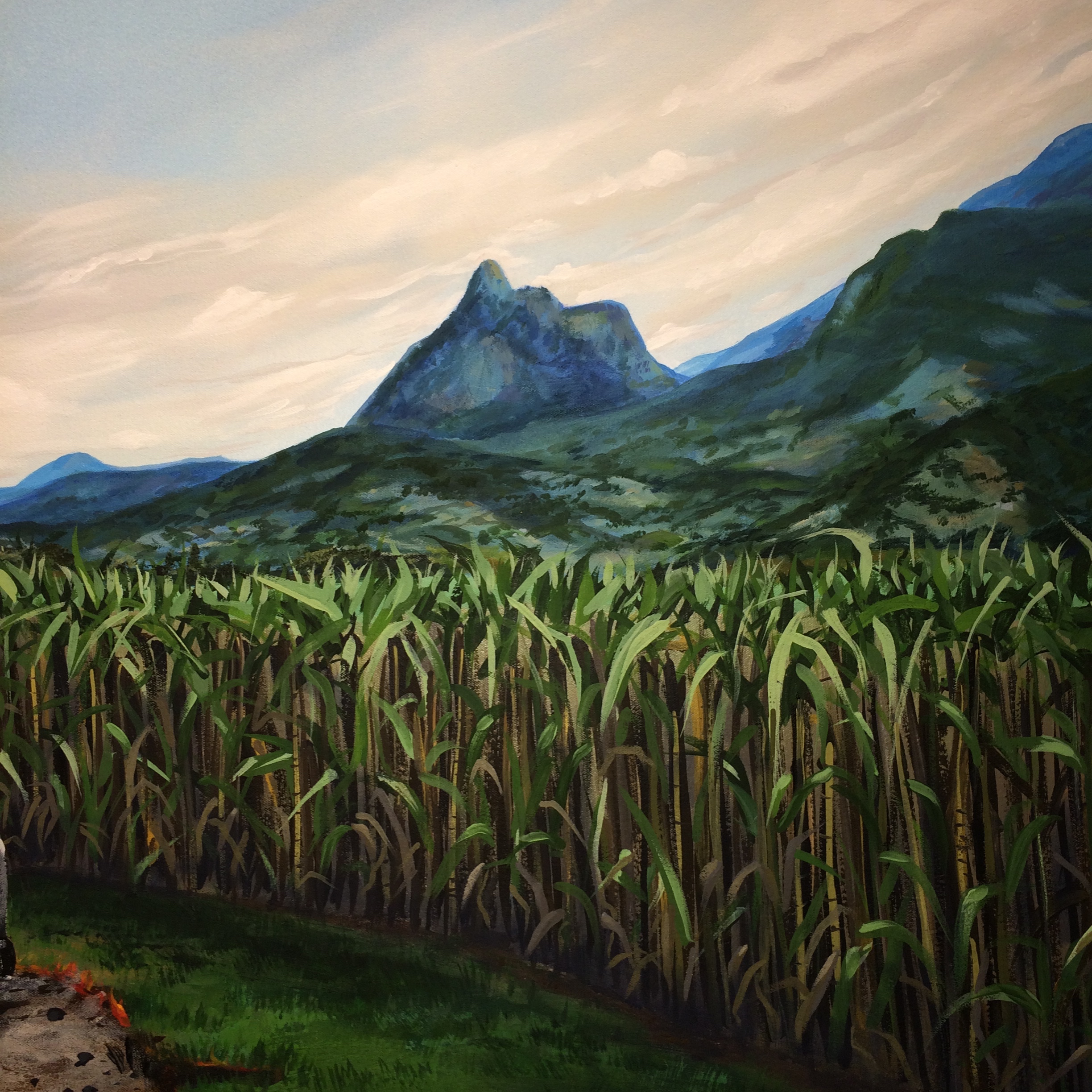
Spending so much of my time travelling around painting in towns all over I have been lucky enough to see some epic landscapes and stay at memorable locations. I realised I had quite a few photos that were calling to be painted. Photos are a great way to capture an image however a painting is produced taking in the feeling that made the memory. Using these original photos as reference I produced a new body of work.

I had a venue in mind in Barcaldine, an old pub called The Globe that council had renovated. The buiding has many original heritage features and some cool modern touches, with a great exhibition space and facilities for functions. It was a short time later it clicked that of course Full Circle was destined to take place at the Globe! After working on 14 canvasses towards the show and booking the venue I called in to take another look keen to see if I was on track to fill the main gallery. I was not surprised to see there is exactly 14 perfectly spaced spots to hang work. More recently a circular viewing tower has been added to the building.

Searching beyond a curved horizon we decipher moments in time. exchanging energies. Connected by a sphere orbiting between day and night in an expanding universe. Just the seasons change our experiences often rotate Full Circle. See the gallery or purchase artwork direct from Sauce.

Blackall

IMG_5145.jpeg

One of the reasons I love travelling the Queensland outback is the abundance of inspiration for art. Arid landscapes that chase a never ending horizon, the vibrant colours of sunset, reflections in waterholes are all things of great natural beauty and leave their mark as memories whilst solidifying a connection to the land.

During my most recent trip to the outback I captured a bunch of interesting photos. This setting not far from Blackall may be relatable to many in the bush. A storm brewing afar while the glow of afternoon sun saturates a nearby paddock.  

Since returning to my studio, in between other commissions and side projects Iv’e been working on a series of new fine art. The new body of work is based on original photographs from my travels. I had to postpone my plans for a solo exhibition the past two years because of a global pandemic, maybe next year who knows I’m just enjoying pushing some paints on the canvas in the meantime.

I have entered this oil on canvas titled Tumbar Road Blackall into this years Blackall Annual Art Exhibition. 91.4cm x 45.7cm 

Caba Creative Trail

Caba Creative Trail

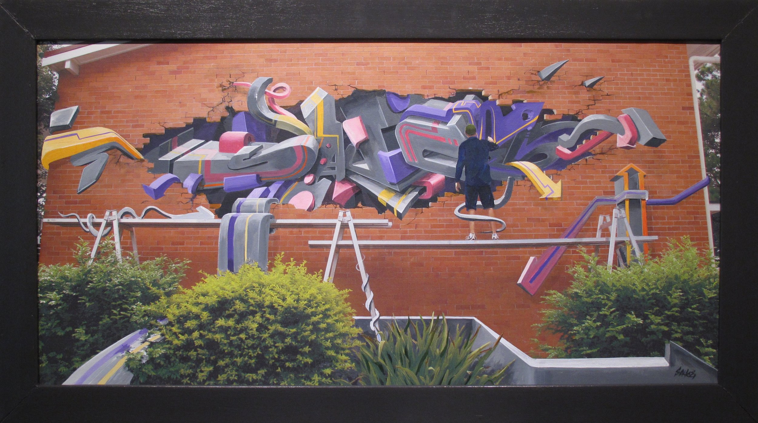
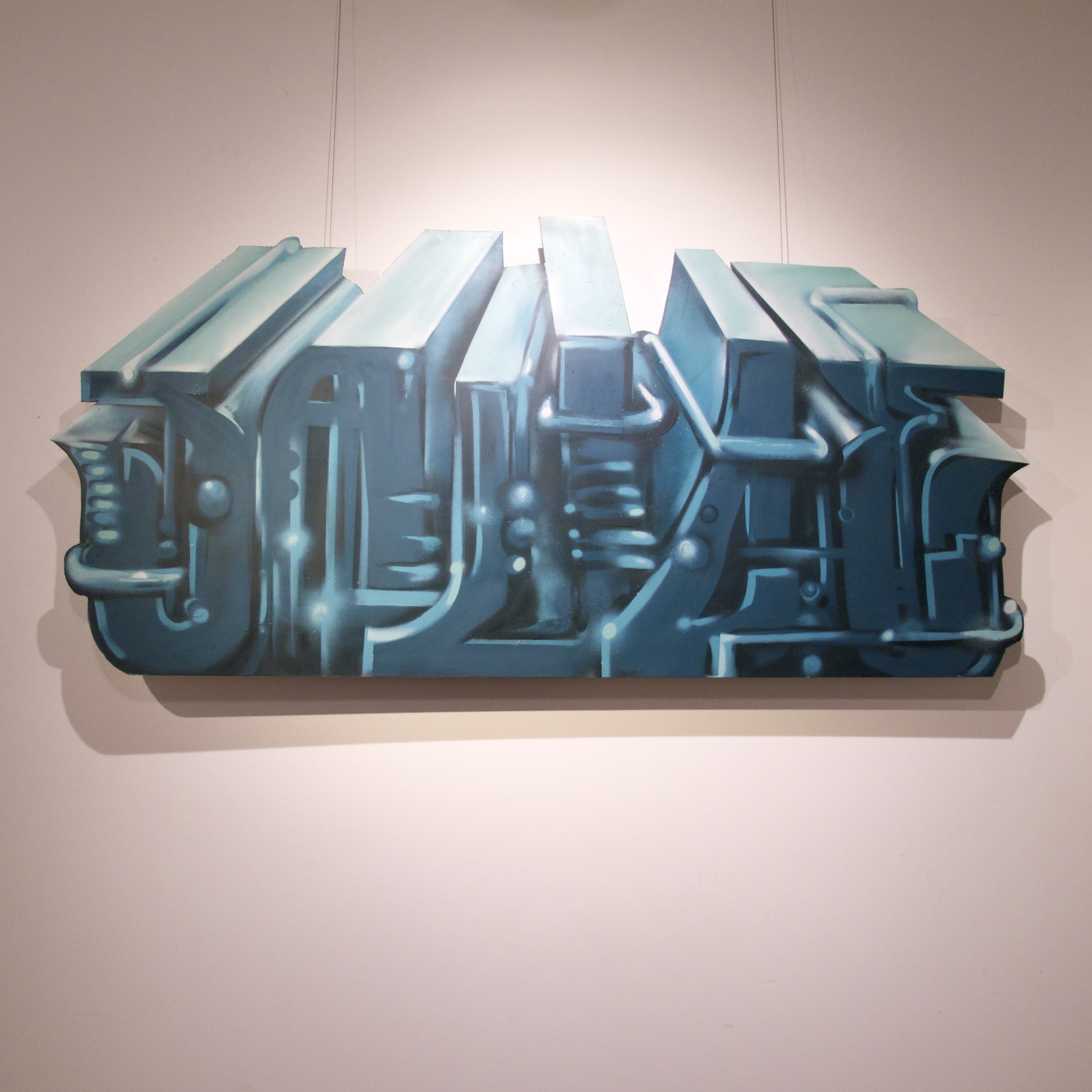
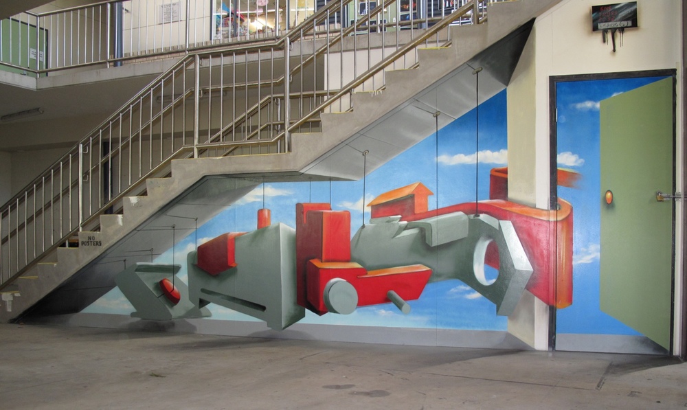
Installation work is where Sauce is keen to keep pushing the boundaries and experimenting with. For this work, he used aerosol on a composite board, creating a three dimensional effect to contrast with the natural landscape. 

Read More

Five Letters

fiveletterspieceweb.jpg

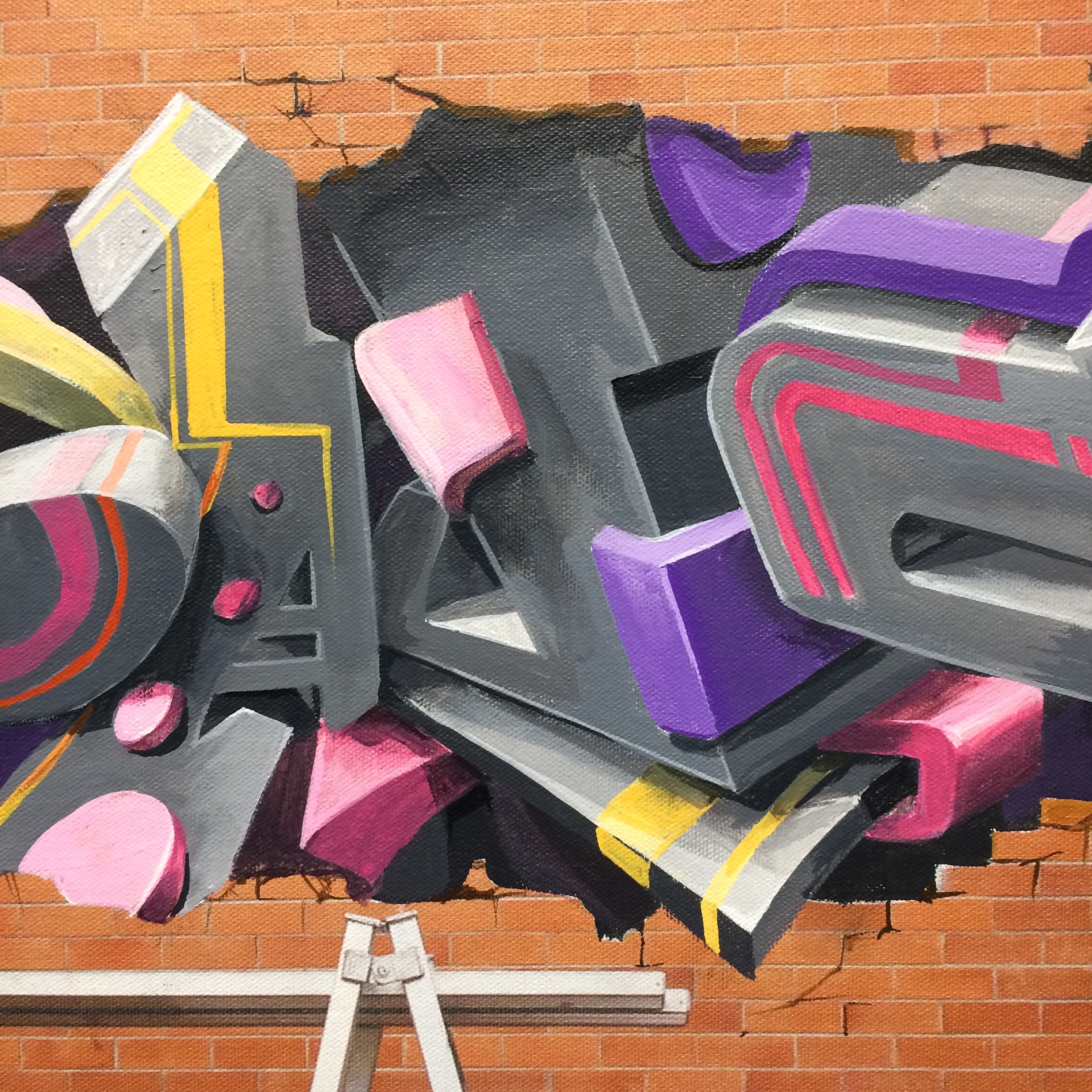
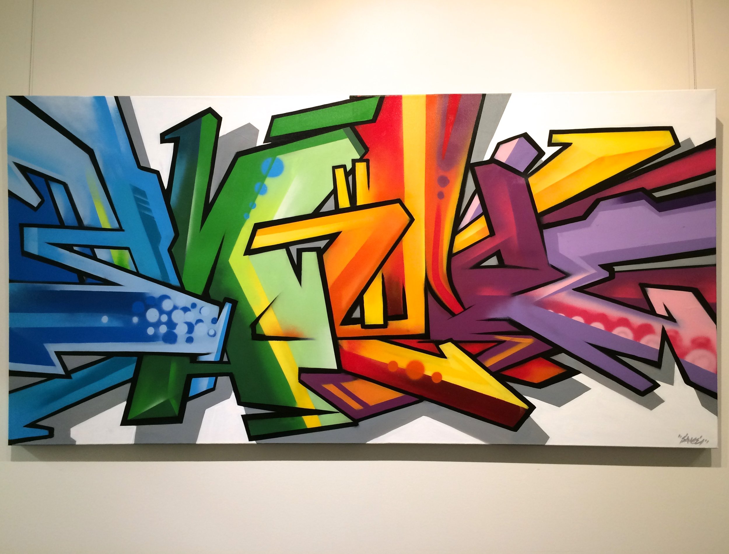
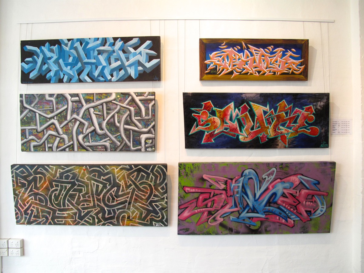
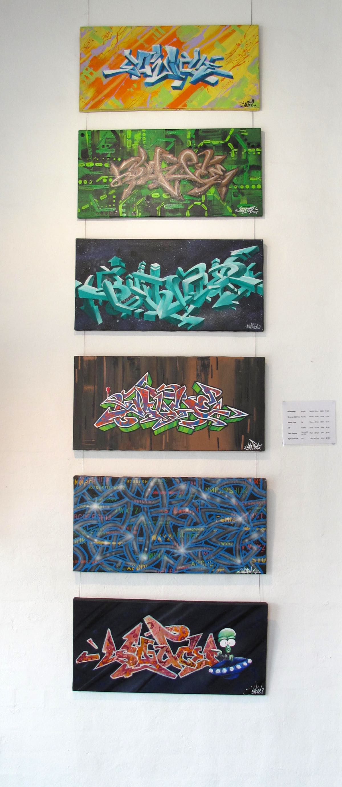
Five Letters was a solo retrospective for aerosol artist, Sauce. Sauce started sketching and painting the back of factory walls in 1994 and his back catalogue is filled with images which represent graffiti lettering and hand-style tags. Five Letters was not about showcasing gentrified graffiti, rather it was a celebration of Sauce’s roots and the ‘good old days’ when painting was about riding the lines and using whatever paints you could get your hands on. 
FiveLettersAweb.jpg
FiveLettersBweb.jpg
FiveLettersDweb.jpg
FiveLettersCweb.jpg
FiveLettersEweb.jpg

Welcome to Caba


Last Saturday Destination Tweed held their annual event Tweed Fusion, which promotes arts and culture in the Tweed. As a part of the celebrations, we joined the cool crew at Caba Creative at Norries Headland for some aerosol art demonstrations where Sauce painted a mural on the amenities block. Cabarita is an amazing beach, and it was the perfect day for markets, live music and interactive art. We met some great people, and hope to work with the community again in the future. 

Parks and Recreation

Over the weekend, Sauce and I caught an old Parks and Recreation episode, The Camel where the Parks Department design a new mural for the town. Not only did we laugh ourselves silly because Parks and Recreation is one of the best Sit-Coms around (Ron Swanson is pretty damn funny), but the episode remind us of some experiences we’ve both had when dealing with past clients and councils. In light of the mistakes made by Leslie Knope and the rest of her team in the Parks Department, I thought I would add a post with some hints and tips about designing and commissioning a mural.


  •  Have a clear idea about why you’re commissioning a mural, and allow this to set the tone and theme. If you want a mural to encompass a town, think of the narrative or story that town has to offer. Also, keep in mind of the whole story of the town. In the Parks and Recreation episode, a new mural was commissioned, since the original mural was defaced due to it’s racist undertones. 


  • Who is the target audience? Is this mural a part of a graffiti management strategy, or is it about adding colour? Is the mural a part of your advertising strategy, or all of the above? A mural can be an effective way to discourage unwanted vandalism, but this is only going to work if it is culturally appropriate. The target audience should influence and shape the theme. A lovely and peaceful scene of an elderly person feeding the pigeons in the park sounds great on paper, but if you want to deter vandalism, you’re going to need to add something a bit more relevant.

  •  Where is the mural? If the mural is in the CBD of town, or an area of high traffic, then it is worth spending more time and effort to make it stand out and memorable. If the mural is in a town, will people be taking photos and selfies in front of it? Is this mural a large component of your advertising strategy? The saying of ‘you get what you pay for’ rings true here. If you want a showpiece or stand out feature, it pays to hire a professional mural artist who can guide you through the design process. By asking people with no public art experience and expecting a committee to make an assertive and creative design you’re just setting yourself up for failure. And let’s not forget one of the most realistic lines from the show:

Landscape Architect: “It’s a camel.”

Leslie Knope: “A camel?”

Landscape Architect: “A camel is what you get when you ask a committee to design a horse.”

And lastly, be mindful of simplicity. There is nothing worse than a convoluted message which tries to be all things at once. 
 

To organise a design consultation, contact us today.