Straya!

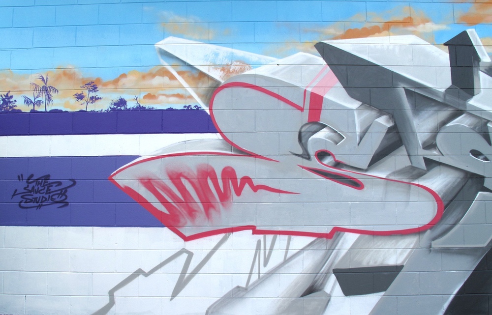
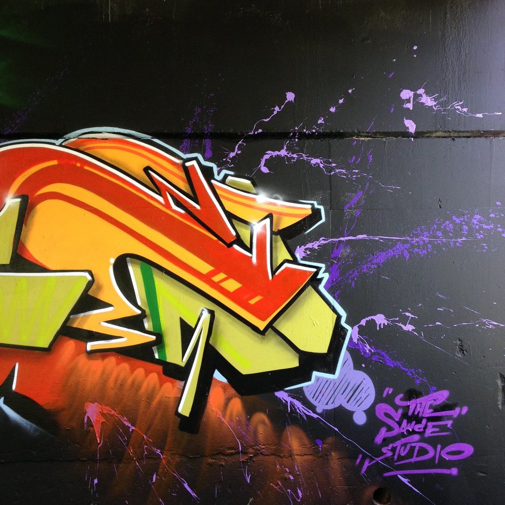
Each year, our rad mates from Brisbane throw a backyard party on Aussie Day. The party changes as the tribe grows but the essentials are all there, like goon-inspired punch, snags on the barbie, bogan inspired costumes, and the Triple J Hottest 100 on the stezza. Since everyday is a good day for a paint, Sauce contributed to the party vibes and smashed out this chrome-effect filled piece. Mad props to our Brisbane friends who know how to throw a party!

And I don’t want to get too political, but Sauce and myself would like to pay tribute to the First Peoples who walked this country. Australia was colonised, not settled and was indeed inhabited for thousands of years before Captain Cook made it to our shores. When are we going to get a new flag?

Aus Day 15 1web.jpg
ausday15web.jpg
Aus Day 15 2 web.jpg

Loganlea Dance Studio

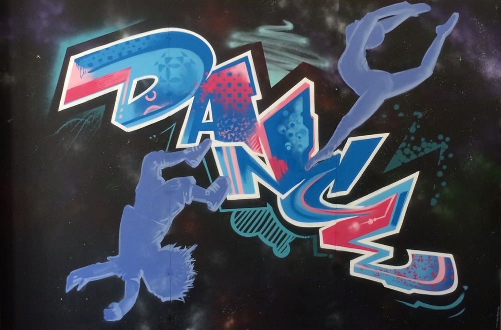
We were recently contacted by Loganlea State High to add some colour to their dance studio. It was a small and simple mural to create as like the other recent studio mural Sauce created, it was painted off-site on MDF ply and then attached to the wall. This process allowed Sauce to create the mural while juggling other work commitments, and since this mural was for the interior of the dance studio, there were no interruptions with lessons. It also made perfect sense to create an aerosol art backdrop for the dance studio since graffiti and breakdancing are all a part of the hip hop culture.

If your studio needs a backdrop, give us a call. It’s easier than you think. 


MTN Australia

The might fine folk at MTN Australia featured Sauce on their blog! As an independent artist, it’s always exciting to receive recognition for your efforts. 


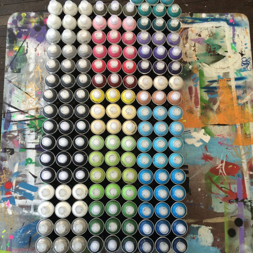
Sauce has always used the best quality paint he can source. Since his artwork is his best form of advertising, he can’t afford to be associated with poor quality, which is why he made the choice to exclusively use MTN 94. 

In the Sauce Studio, we also think it’s a perfect match since Sauce started paining in 1994, which was the same year MTN was created. It can’t be a coincidence!


Parks and Recreation

Over the weekend, Sauce and I caught an old Parks and Recreation episode, The Camel where the Parks Department design a new mural for the town. Not only did we laugh ourselves silly because Parks and Recreation is one of the best Sit-Coms around (Ron Swanson is pretty damn funny), but the episode remind us of some experiences we’ve both had when dealing with past clients and councils. In light of the mistakes made by Leslie Knope and the rest of her team in the Parks Department, I thought I would add a post with some hints and tips about designing and commissioning a mural.


  •  Have a clear idea about why you’re commissioning a mural, and allow this to set the tone and theme. If you want a mural to encompass a town, think of the narrative or story that town has to offer. Also, keep in mind of the whole story of the town. In the Parks and Recreation episode, a new mural was commissioned, since the original mural was defaced due to it’s racist undertones. 


  • Who is the target audience? Is this mural a part of a graffiti management strategy, or is it about adding colour? Is the mural a part of your advertising strategy, or all of the above? A mural can be an effective way to discourage unwanted vandalism, but this is only going to work if it is culturally appropriate. The target audience should influence and shape the theme. A lovely and peaceful scene of an elderly person feeding the pigeons in the park sounds great on paper, but if you want to deter vandalism, you’re going to need to add something a bit more relevant.

  •  Where is the mural? If the mural is in the CBD of town, or an area of high traffic, then it is worth spending more time and effort to make it stand out and memorable. If the mural is in a town, will people be taking photos and selfies in front of it? Is this mural a large component of your advertising strategy? The saying of ‘you get what you pay for’ rings true here. If you want a showpiece or stand out feature, it pays to hire a professional mural artist who can guide you through the design process. By asking people with no public art experience and expecting a committee to make an assertive and creative design you’re just setting yourself up for failure. And let’s not forget one of the most realistic lines from the show:

Landscape Architect: “It’s a camel.”

Leslie Knope: “A camel?”

Landscape Architect: “A camel is what you get when you ask a committee to design a horse.”

And lastly, be mindful of simplicity. There is nothing worse than a convoluted message which tries to be all things at once. 


To organise a design consultation, contact us today.


Increase the Peace

After opening The Sauce Studio in March 2013, Sauce and I were adamant something had to be done “about that wall”. By then the wildlife mural had some new additions including genitalia to the fauna and some political statements about drug use, which just reinforced Sauce’s ideas about reinvigorating the wall with a fresh coat of paint. After a quick chat with the store owner and a few discussions with the building owner, we secured permission for the wall, but no funding, so we had to wait a little longer. I tried to source some grant funds, but the timing wasn’t right and since it was an aerosol project it added another level of challenges with various funding concepts. At one stage both Sauce and myself tried to approach both the local Tweed Council and the local Tweed Regional Art Gallery, however both organisations made it abundantly clear they had neither the infrastructure or the interest to make such a project happen. When we had a meeting with the management of the Community and Cultural Services (after numerous weeks and months of waiting) we were informed there was no budget for any public art and despite recently passing a new policy and people employed to approve such projects, there was still no way council would be involved with any artist driven projects.  
Read More

Gentrified Graffiti

Welcome back to #ArtThursday! 
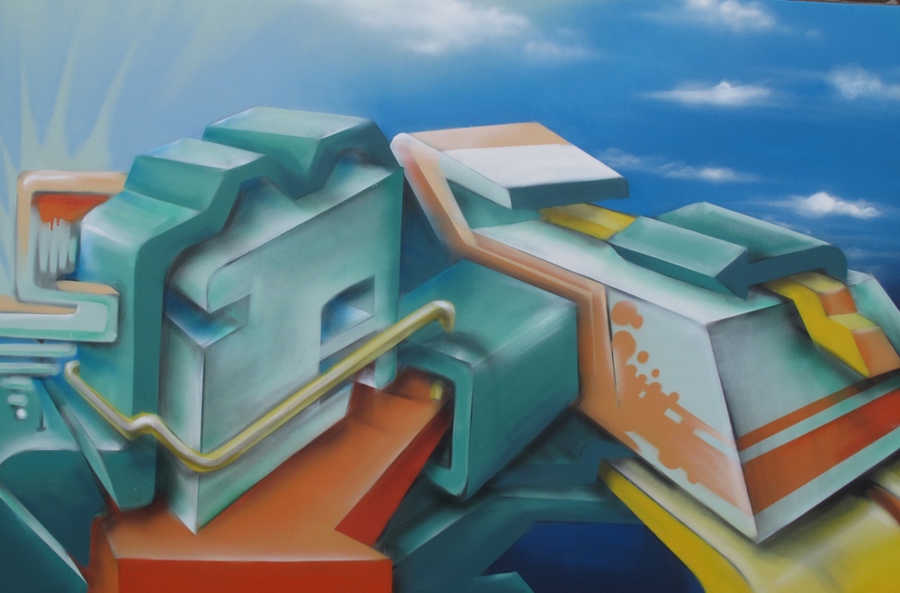
  A & C, aerosol on canvas. Sauce, 2014.

This week I want to about graff and galleries. For some time now, Sauce has been painting smaller graffiti pieces on canvas. Some of these works have won awards and hung in fine galleries, and others now live in suburban lounge-rooms, which strikes the question: Does graffiti belong in the gallery?


The short answer is yes. Graffiti, aerosol art and street art are legitimate art forms and are definitely a part of the urban expression and deserve a place in our galleries, museums and cultural homes. 


De-stagnate, aerosol on canvas. Sauce, 2013

But… What is this doing to the art form and culture of graffiti and what about it’s rebellious roots in railways and razor wire? By removing the art form it’s ‘natural habitat’ are we devaluing and watering down it’s effects and messages? What is the state of the wider culture of hip hop, when a piece of pastiche and derivative stencil art piece can command a small fortune*? 


There is no short or easy answer to the problems of gentrified graffiti, however it does allow artists to expand their repertoire and practice their skills. Essentially, this cultural shift of graffiti in galleries commands artists to delve further into their arts practice and hone their craft, and at the very least, it allows the graffiti artist to escape the authorities one more time. 


Something Sweet, aerosol on canvas. Sauce, 2013


*I could delve further into this and explain it in terms of Bourdieu and maybe even Simmel but who’s got time for that?

Elevation


Positive Energy Activates Constant Elevation - Gravediggaz


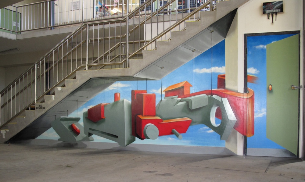
In the current political climate it is challenging to find suitable walls for aerosol artists, so when the principal from Upper Mt Gravatt gave Sauce the all clear, he jumped at the chance to smash out some 3D work. This wall was completed over two days, as the first day was spent at the school rejuvinating some old work and looking at another site for a new mural. On the second day, Sauce worked on the details of the 3D elements. 
Sauce was pleased with his efforts, and when he made it home, we discussed the need to just paint. How sometimes, it is difficult to balance painting murals with koalas and painting a good solid graff piece. Sometimes, just finding a wall to paint is a mammoth task in itself! I really like the colour scheme in this one and Sauce is already itching for another paint. If you’ve got a wall that needs a good old fashioned graff piece, let us know!   


Birthday Bash 2014

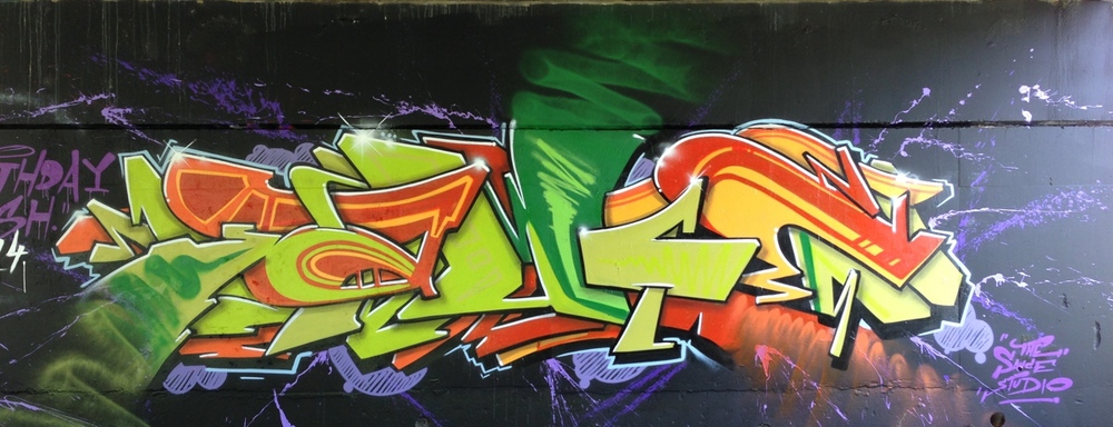
My good mate Kosie1 and I started a tradition a few years back, where we start the year with a join-up. Both of us celebrate birthdays in January, so it’s a great excuse to take some time out and catch up for a paint and a beer (although, this time it was a coffee, as we started painting at 7 am and we both had to work in the afternoon!). Style wise, we did difference pieces with a shared colour scheme. It was cool to paint with a mate and not have to think about anything except for the piece.