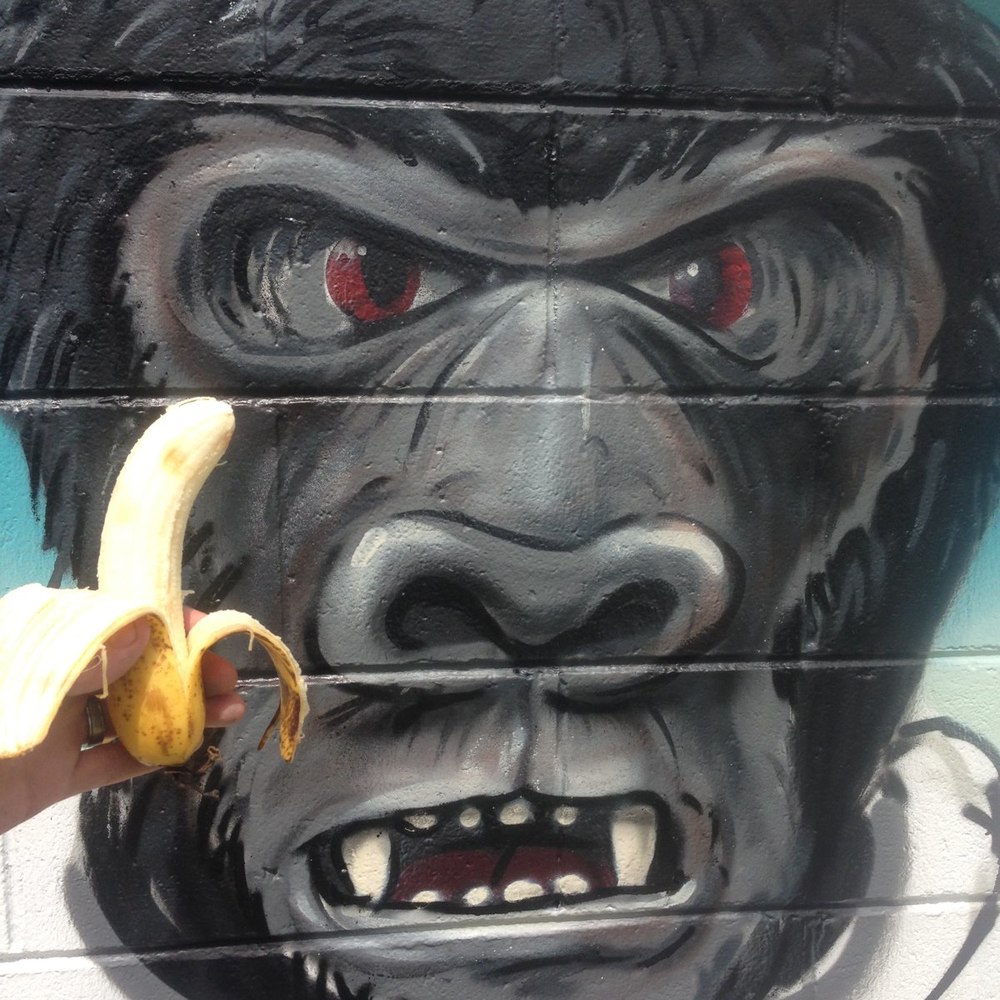
Coalstoun Lakes State School

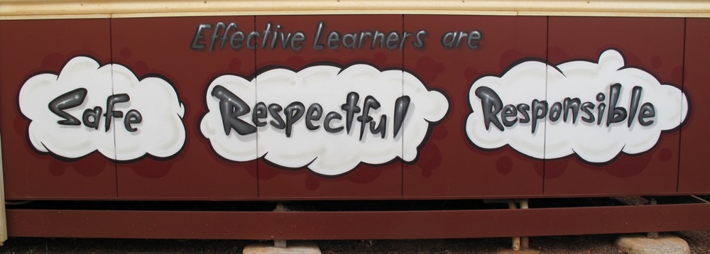
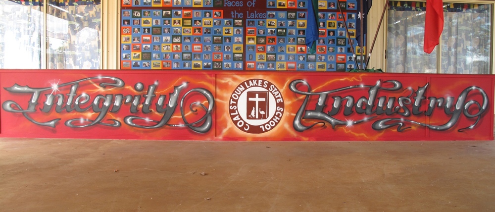
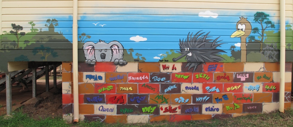
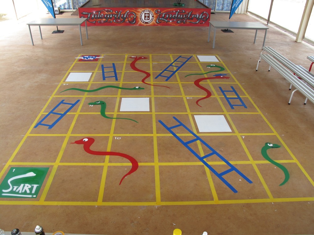
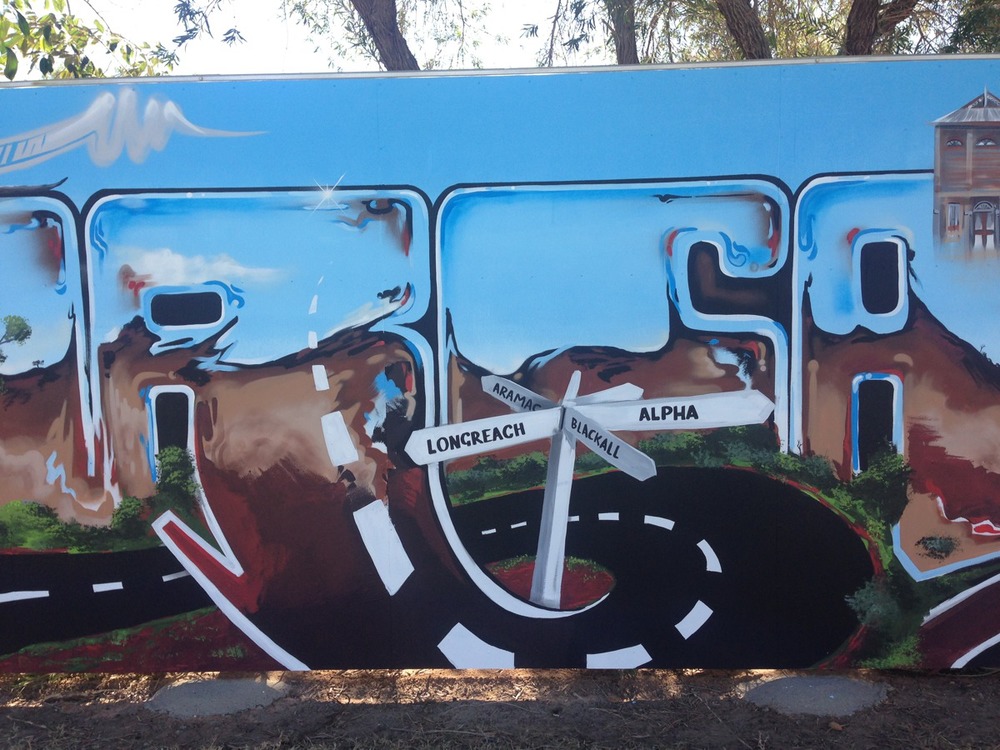
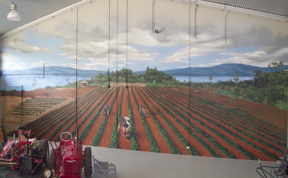
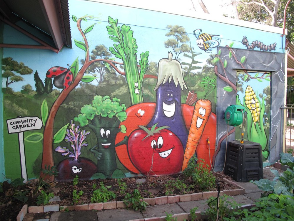
Once Mooshka received a revamp, it was time to get back in the Mural Truck and head to Coalstoun Lakes State School.  

Sauce worked with the principal Mr. Reed a few years ago in Muttaburra, so it was great to reconnect with old friends and it was even better to see an early career principal leading the way and reinvigorating the school community.

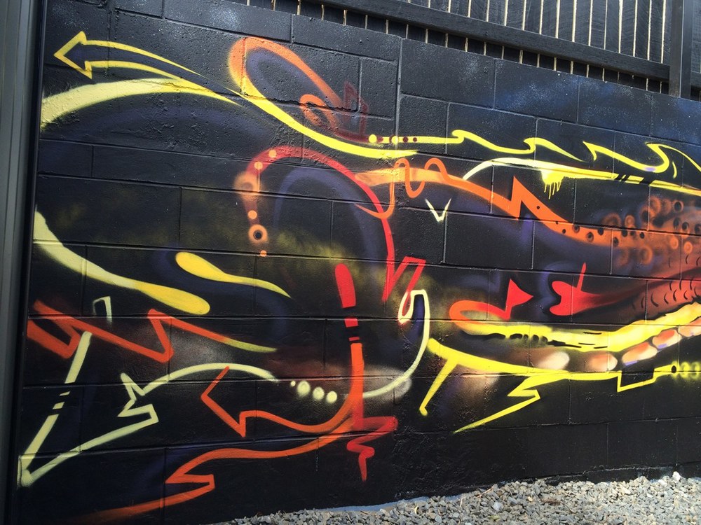
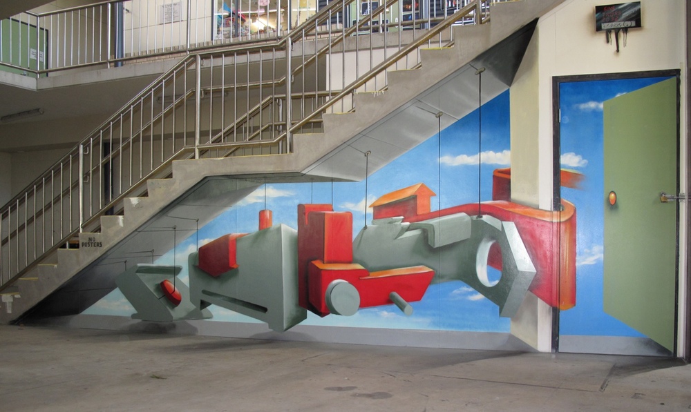
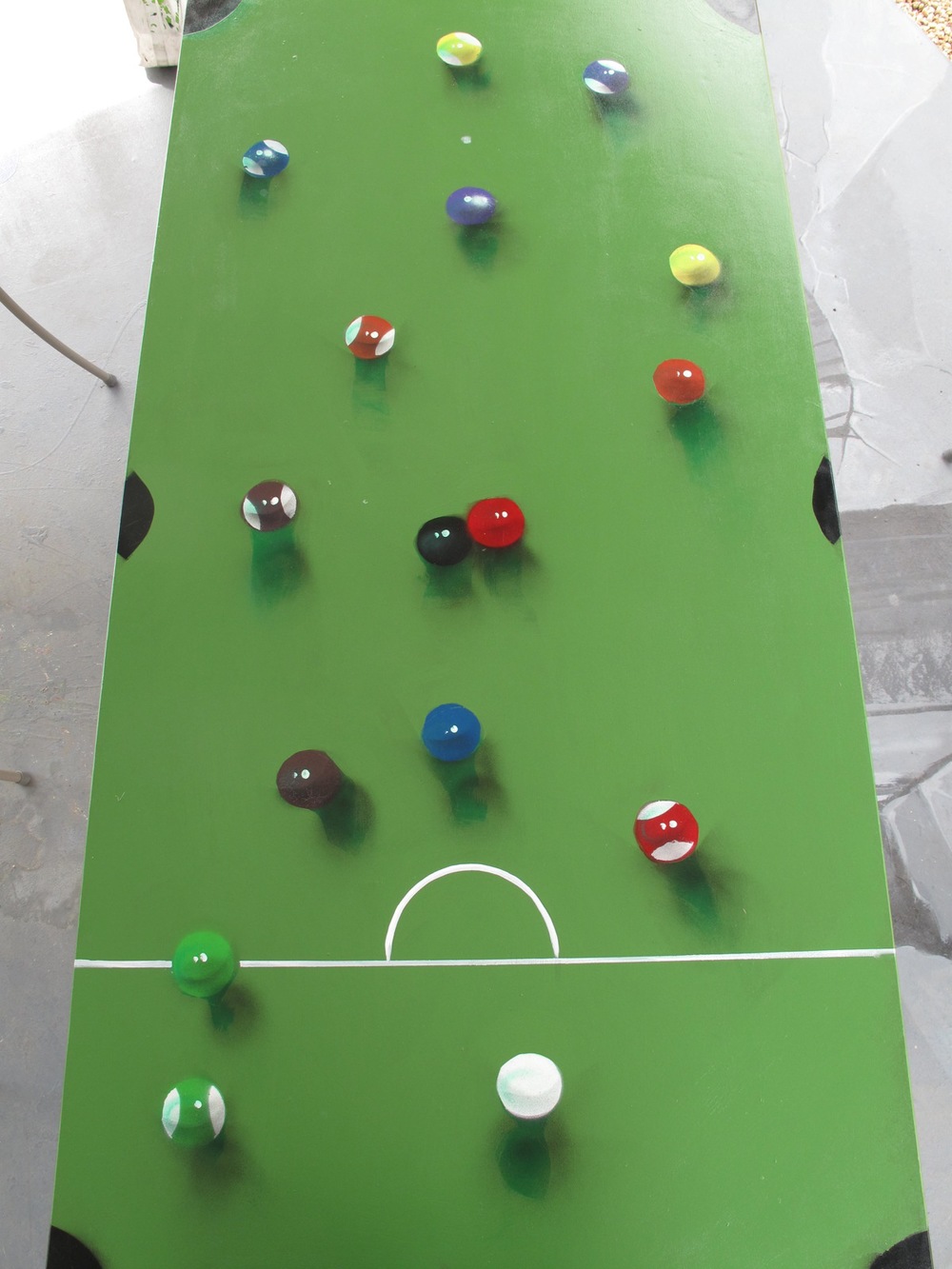
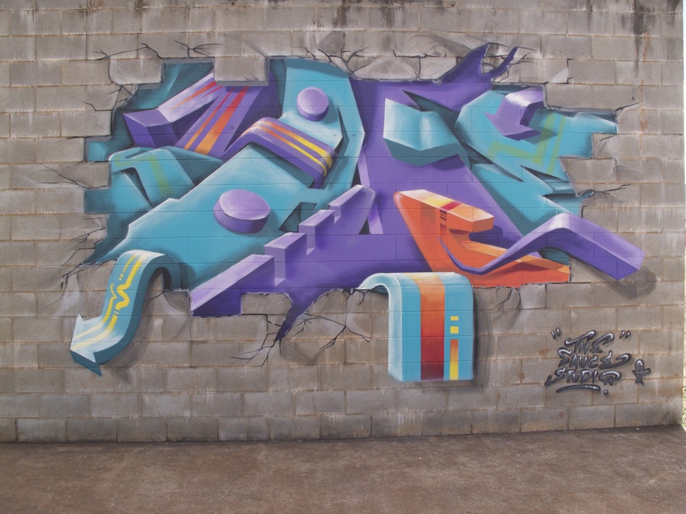
After creating several murals throughout the school during the week, Sauce also squeezed in a 3D piece before his next stop, the Emerald Aquatic Centre

MTN Australia

The might fine folk at MTN Australia featured Sauce on their blog! As an independent artist, it’s always exciting to receive recognition for your efforts. 


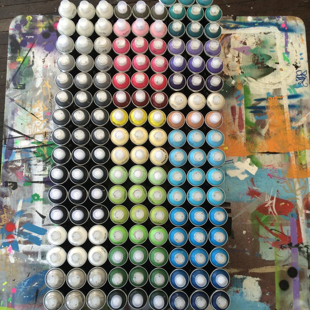
Sauce has always used the best quality paint he can source. Since his artwork is his best form of advertising, he can’t afford to be associated with poor quality, which is why he made the choice to exclusively use MTN 94. 

In the Sauce Studio, we also think it’s a perfect match since Sauce started paining in 1994, which was the same year MTN was created. It can’t be a coincidence!


The Dragon and the Buddha

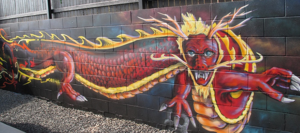
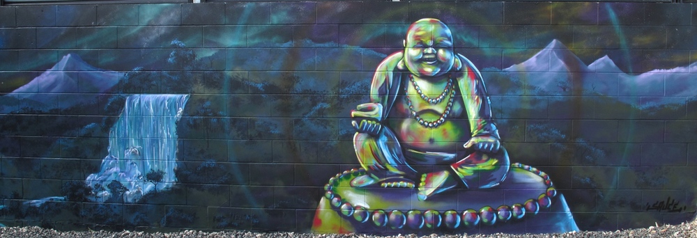
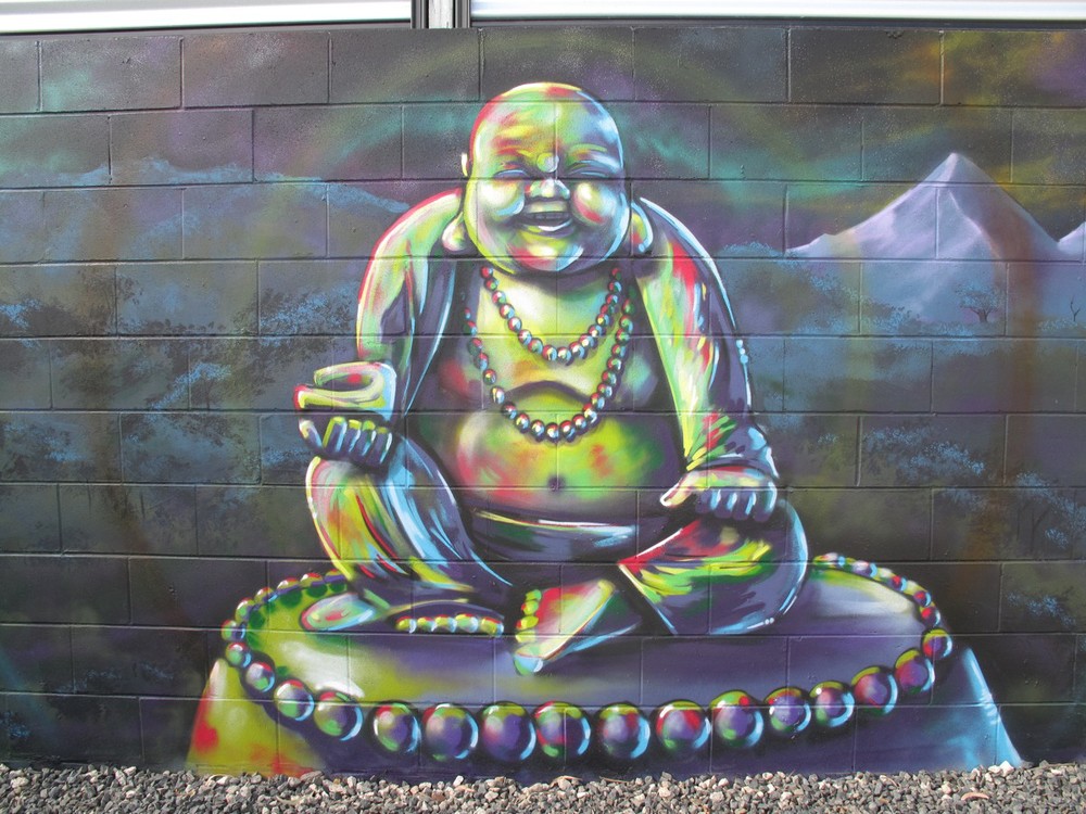
This smiling Buddah was for a heavy metal dude in suburban Brisbane. I received a call while Sauce was on his previous tour of Central QLD, for an enquiry about a mural with the aurora borealis, a Chinese Buddah and a dragon. It sounded great, but we needed to be patient, as Sauce only had a few weeks in-between his next trip away. 

The family who commissioned this mural were great to work with. Not only were they patient, they entertained Sauce with great rotation of heavy metal while being a pleasure to work with. The design elements were easy, since they had a clear idea about what they wanted, but they also let Sauce take some artistic licence where necessary. 
Apparently, the family were so happy with the outcome, they were arguing amongst themselves as to whose idea it was to get Sauce to the mural! We think it looks pretty rad as Buddah is always an effective image to work with. 

Parks and Recreation

Over the weekend, Sauce and I caught an old Parks and Recreation episode, The Camel where the Parks Department design a new mural for the town. Not only did we laugh ourselves silly because Parks and Recreation is one of the best Sit-Coms around (Ron Swanson is pretty damn funny), but the episode remind us of some experiences we’ve both had when dealing with past clients and councils. In light of the mistakes made by Leslie Knope and the rest of her team in the Parks Department, I thought I would add a post with some hints and tips about designing and commissioning a mural.


  •  Have a clear idea about why you’re commissioning a mural, and allow this to set the tone and theme. If you want a mural to encompass a town, think of the narrative or story that town has to offer. Also, keep in mind of the whole story of the town. In the Parks and Recreation episode, a new mural was commissioned, since the original mural was defaced due to it’s racist undertones. 


  • Who is the target audience? Is this mural a part of a graffiti management strategy, or is it about adding colour? Is the mural a part of your advertising strategy, or all of the above? A mural can be an effective way to discourage unwanted vandalism, but this is only going to work if it is culturally appropriate. The target audience should influence and shape the theme. A lovely and peaceful scene of an elderly person feeding the pigeons in the park sounds great on paper, but if you want to deter vandalism, you’re going to need to add something a bit more relevant.

  •  Where is the mural? If the mural is in the CBD of town, or an area of high traffic, then it is worth spending more time and effort to make it stand out and memorable. If the mural is in a town, will people be taking photos and selfies in front of it? Is this mural a large component of your advertising strategy? The saying of ‘you get what you pay for’ rings true here. If you want a showpiece or stand out feature, it pays to hire a professional mural artist who can guide you through the design process. By asking people with no public art experience and expecting a committee to make an assertive and creative design you’re just setting yourself up for failure. And let’s not forget one of the most realistic lines from the show:

Landscape Architect: “It’s a camel.”

Leslie Knope: “A camel?”

Landscape Architect: “A camel is what you get when you ask a committee to design a horse.”

And lastly, be mindful of simplicity. There is nothing worse than a convoluted message which tries to be all things at once. 


To organise a design consultation, contact us today.


Emerald May - June 2014


Things may have seemed quiet in the studio for the past month, but Sauce has been anything but quiet. Last month, he toured Central Queensland with thanks to Anglicare CQ and spent the past month flat out like a lizard drinking. Anglicare celebrated thirty years of service this year, and we realised that Sauce has been working with the organisation for the past decade. 


For this trip, the Anglicare CQ team from Emerald kept him busy with countless workshops for the young people of Emerald and he painted a few murals too. The locals of Emerald also keen to have their walls painted and Sauce managed to smash a few commissions too. 


It wasn’t all work and no play. Hayley (the most effective and efficient Youth Worker this side of the Black Stump), was generous enough to take Sauce to Fairburn Dam for the day where he indulged in some wake boarding! The Emerald and CQ crew are always a pleasure to work with, and Sauce is already planning to head back out again. Next stop: Barcaldine. 


As you can see, Sauce has loads of pictures from his trip away. Too many for one blog post! To see the action unfold, follow us on Instagram!


Increase the Peace

After opening The Sauce Studio in March 2013, Sauce and I were adamant something had to be done “about that wall”. By then the wildlife mural had some new additions including genitalia to the fauna and some political statements about drug use, which just reinforced Sauce’s ideas about reinvigorating the wall with a fresh coat of paint. After a quick chat with the store owner and a few discussions with the building owner, we secured permission for the wall, but no funding, so we had to wait a little longer. I tried to source some grant funds, but the timing wasn’t right and since it was an aerosol project it added another level of challenges with various funding concepts. At one stage both Sauce and myself tried to approach both the local Tweed Council and the local Tweed Regional Art Gallery, however both organisations made it abundantly clear they had neither the infrastructure or the interest to make such a project happen. When we had a meeting with the management of the Community and Cultural Services (after numerous weeks and months of waiting) we were informed there was no budget for any public art and despite recently passing a new policy and people employed to approve such projects, there was still no way council would be involved with any artist driven projects.  
Read More
Blackbook

Welcome to #artthursday! Now that I (Ainslie Rose) have editorial control over the blog (mwahaha!) I thought I would start a series which investigates the culture and practise of aerosol art. Each Thursday, I’ll talk about the different aspects of aerosol art and delve into the culture of graffiti. To start with, I’ll begin with the Blackbook.
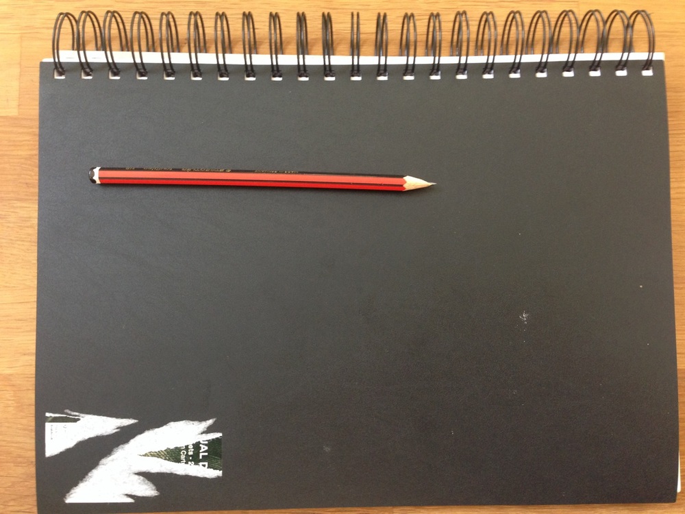
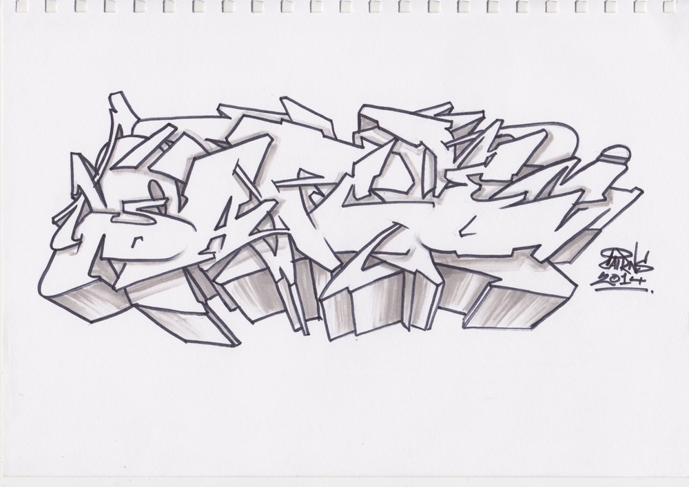
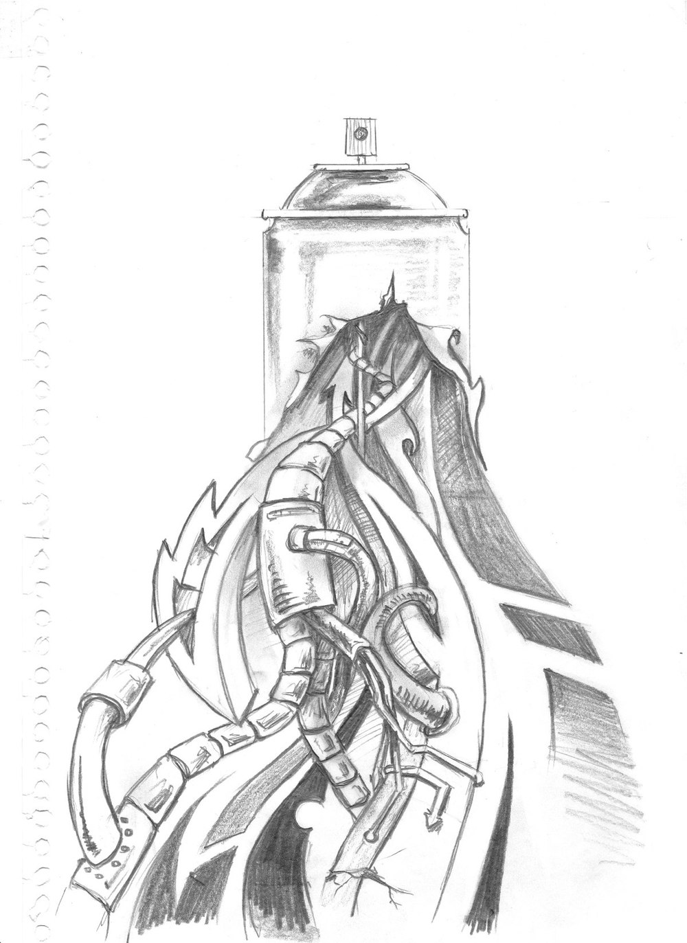
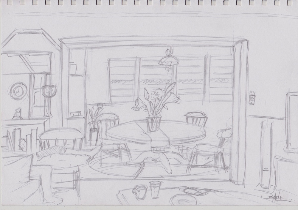
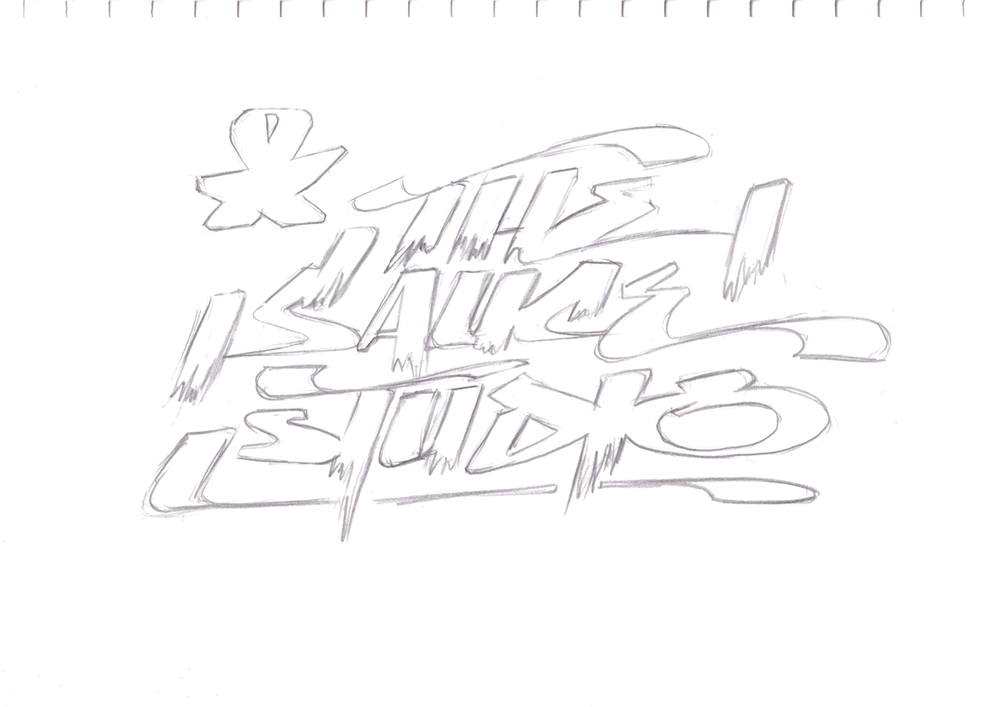
The Blackbook in it’s simplest form is a sketchbook. It’s a dedicated book used by artists to mill over ideas and plan out designs. The exterior is usually plain black, hence the term Blackbook. They can be easily obtained from a newsagent or office supply store and usually have unlined white pages with a thicker GSM. Some aerosol paint brands associated with graffiti culture such as Montana/ MTN and Montana Colors  also carry a line of black books with their branding and some have the option of black pages for the use of metallic markers. The books are usually A4 in size, but larger versions are also available. As an artist, Sauce uses a standard A4 book, available from office supply stores and uses various pencil types for basic sketches and outlines in pen using Artline of Promarker for more complex and interesting designs. When Sauce is working on designs for clients, he prefers to keep the details simple and rarely uses colour. 
All very exciting facts, but it’s the little details which build the culture. The Blackbook (which I’ve written about before) is definitively more than a few doodles on a page and it’s more than vandals planning their next attack. Sketches are mindful mediations which are documented and journaled in the Blackbook  and it is this mindfulness which gives meaning to the graffiti piece. Now, through the mighty powers of social media, artists are sketching pieces and battling for supremacy with other artists all over the globe. When Sauce first stared dabbling and experimenting with Graff, he had a chance encounter with an old school writer, who gave him a quick sketch in Sauce’s Blackbook and it was this organic collaboration which sparked something inside Sauce and spurned him to improve his skills. It’s this type of sharing and creative process which forms the backbone of artist’s creative concepts and ideas.  


Ten One Twenty

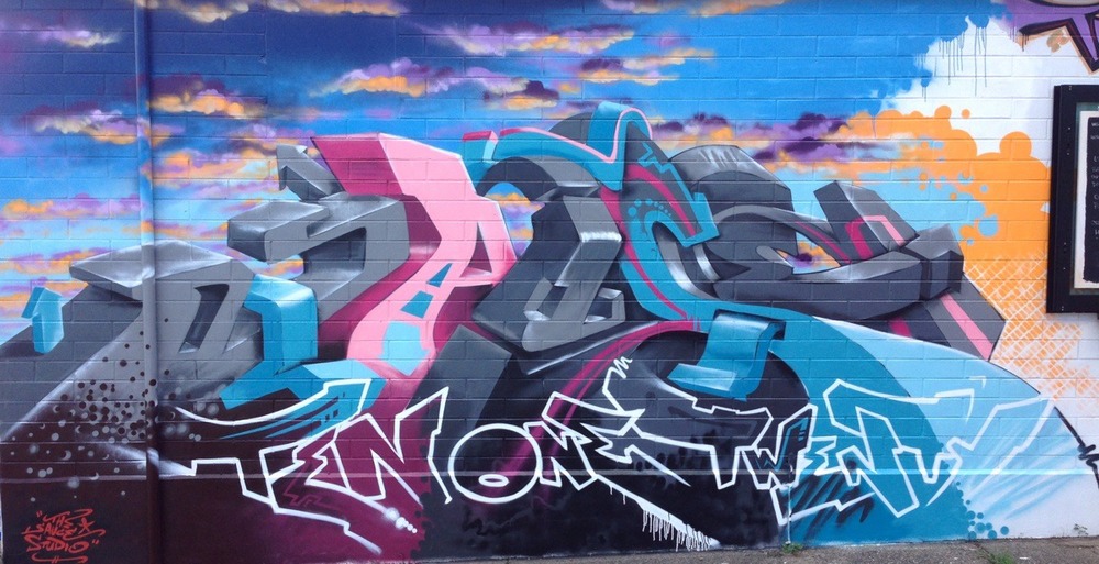
Last week, Sauce headed off to Cairns to take care of some family things and while he was up there, he scouted around to find a good wall. Which was perfect timing, as Ten One Twenty, a gelato and coffee shop was opening at Edge Hill, Cairns and they were on the look out for an aerosol artist. No gig is without challenges, and Sauce tells me it was so hot, his shirt was dripping with sweat (Gross!). It was also difficult to source enough paint with all the different colours, but Sauce, fuelled with coffee and gelato battled on and created a sunset themed 3D graffiti piece. Maybe next time, we’ll make a proper holiday out of it.  

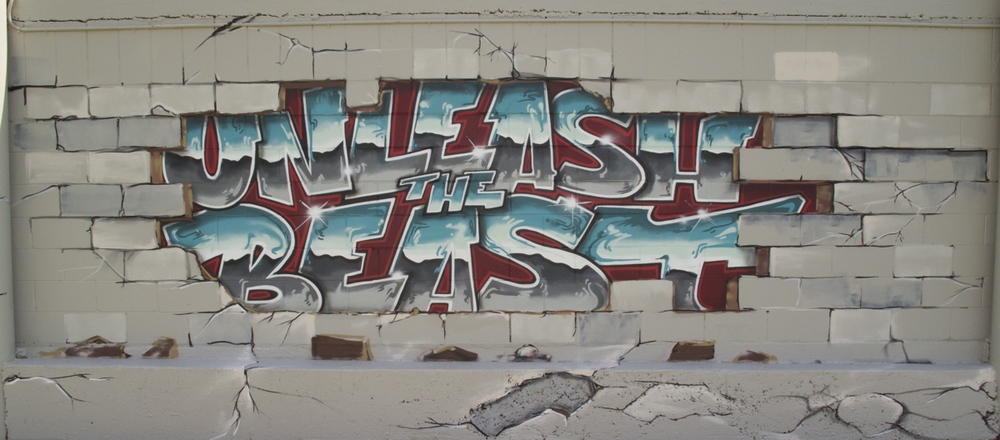
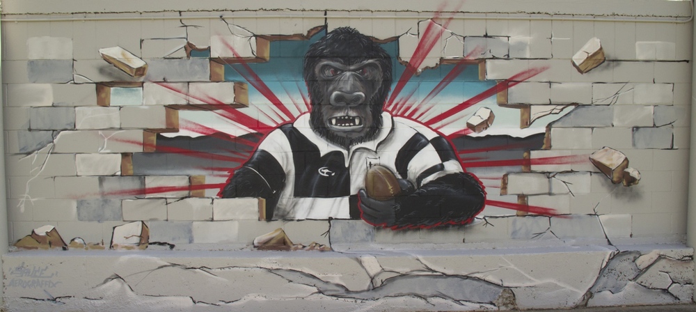
Beast Mode Unleashed


Late last year, we were contacted in the studio by some keen young men from Iona College to create a ‘Seniors’ mural for their school as a leaving gift. The lads wanted something which represented them and their school and something that celebrated their passion for rugby. After some initial consultation with the lads and Father Mark Edwards, the Principal, Sauce smashed out a piece and beast over two days in the sweltering Brisbane humidity.